I’m having fun programming the Apple Watch. What I like the most about the exercise are the challenges of designing a UI for a teeny-tiny device.
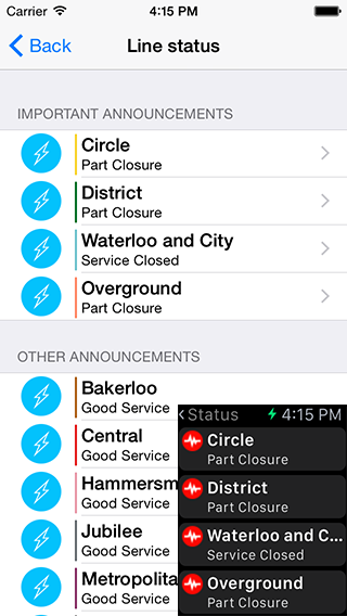
Quite how little space you have to work with can be shown from the image below (these are device screen shots)
The main interface for the iPhone application is the home screen. For your current home station if shows you how painful your commute is about to become.
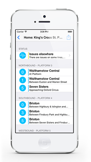
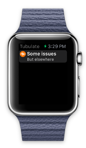
The overall status indicator gives you a high-level overview, you then drill down to the details. I wanted to keep the same approach for the watch application but given the space, compromises needed to be made.
Notice the brevity of the text, “Some issues” and “But elsewhere”, the reality is that the color of the image is the actual indicator that users will care about:
- Red - Issues exist on lines through this station
- Orange - Issues exist on other lines
- Green - No issues on any lines (it does happen, just never on a Monday morning)
If you tap the status button, you get to see the over all line status:
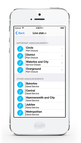
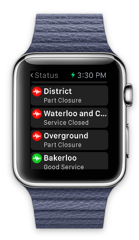
Again, not to bang on about it, but you get 10 lines displayed on the phone, just 4 on the watch and you have to accept that the truncation of long names is going to happen (Part two covers the ‘Solution’ to this where we sacrifice space for words in improve readability!).
Finally tapping a line in the status display takes you to the details of the issues on the line.
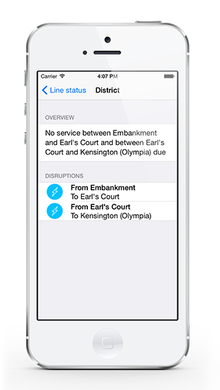
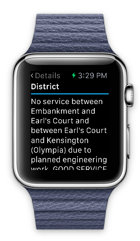
A pretty good start and we have functionality that’ll be useful when the WATCH comes out.
