In the last post I described the main interface to my Apple Watch application for status updates. When we left the UI looked like this:
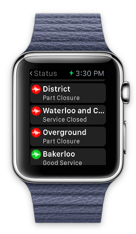
I wasn’t too happy with the truncation on the Line names like “Waterloo and C..” . There are a couple of approaches to addressing this issue. I could create special case watch versions of line names “W’loo & City” for example or, think a little more laterally…
Names are important to commuters, colors possibly more so. For me purple means home (Met line), Brown means fun time (off to the silver cross in Whitehall). Names like Aldgate just mean misery time :-)
The solution was to add a badge to the UI showing the color of the line effected and to support truncated names.
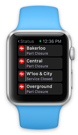
Paradoxically we sacrifice more of the name potentially but still manage to convey more information.
Now you might say that relying on users knowing the colors used for tube lines makes this a feature only suitable for seasoned travelers, but that’s OK as that’s the target demographic (as they say).